Building Your Own Football Analytics Dashboards With Free Data
A template you can use for further automations

What’s a match dashboard?
Is a comprehensive visual report that provides a quick-analytical overview of a football match.
If you missed a match or watched the 90+ minutes and you want to review the statistics quickly, a dashboard helps you get an overview of the tactical and performance insights in one place.
In case you're tracking a league as an analyst, as a scout to flag a player, or even as fan that wants to know how your favorite team performed this weekend, building them can make a difference in how fast you retrieve that information.
I built this dashboard using:
Python 3.10
Beautiful Soup
Pandas
NumPy
Pandas
Matplolib
Mplsoccer
The goal was to build a template with just 6 key analytical plots:
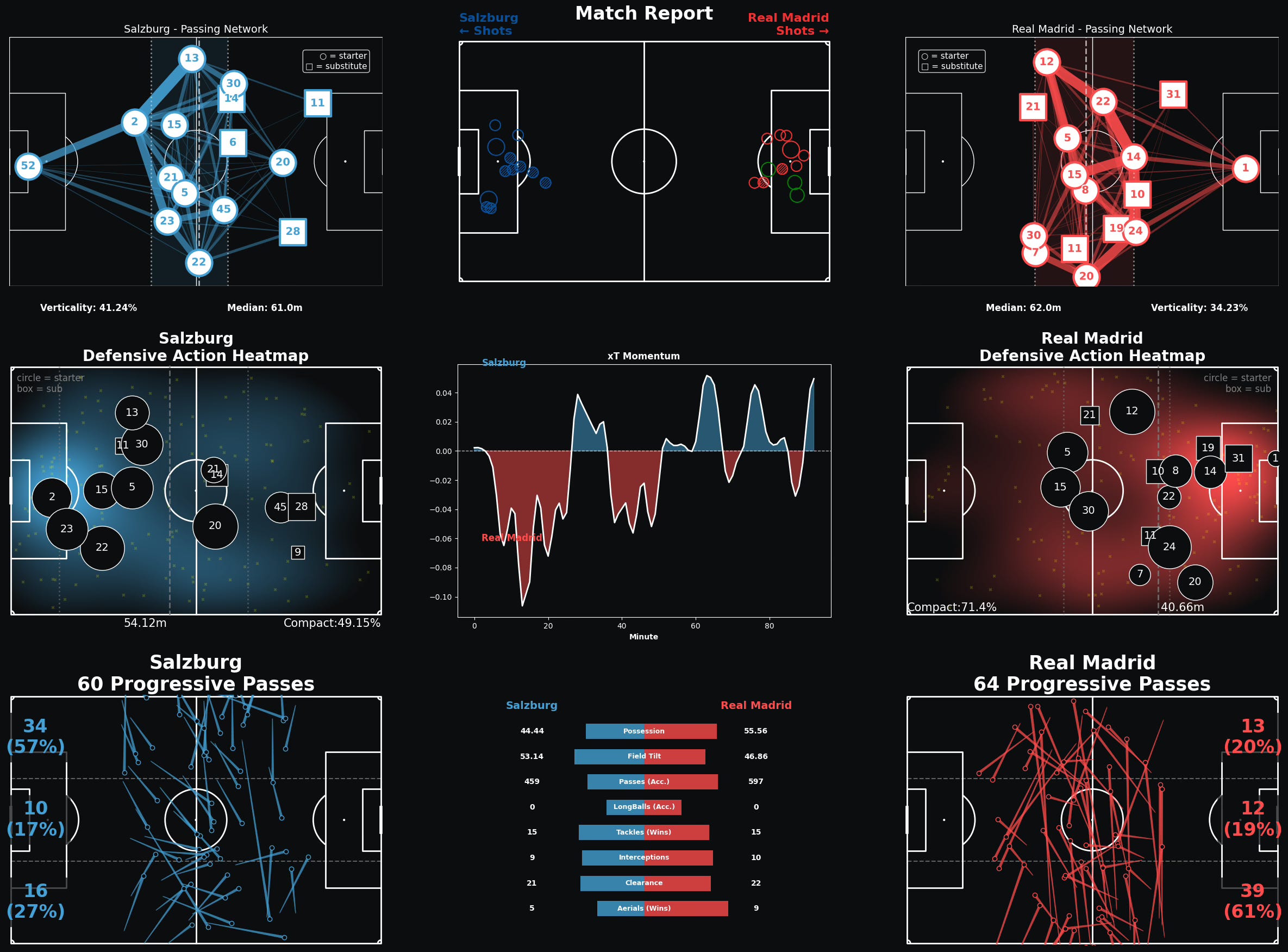
Passing Networks: Shows team shape, player positions, and passing combinations.
Defensive Actions: Reveals pressing intensity, defensive positioning, and team compactness.
Progressive Passes: Analyzes forward progression and attacking build-up patterns
Shot Map: Comprehensive shooting analysis with xG, shot types, and quality assessment.
xT Momentum: Tracks dangerous situation creation, goals, and match momentum shifts over time.
Match Statistics: Side-by-side comparison of key performance metrics between teams.
Where to get the data from?
This is the most important part.
In this case I needed event data for only one match, using coordinates from different situations in the offensive and defensive phases like: Passes, Progressive Passes, Interceptions, Blocks, etc.
These coordinates are represented as X and Y, paired with its end_x and end_y. This helps understanding where and when a situation started, same as where it ended on the pitch.
WhoScored was my go to place to obtain the majority of them. But I was still missing the shots coordinates. Fotmob has them, though it’s a tricky place to obtain them.
I suggest you to visit the GitHub repo and give the scraping logic a look: https://github.com/ricardoherediaj/football-analytics tutorials/blob/main/notebooks/cwc_scraping_test.ipynb
Plotting the Dashboard
After obtaining the data sources, I transformed the raw match events into insights.
In this case I saved the data in CSV and JSON format, you’ll see it at: https://github.com/ricardoherediaj/football-analytics tutorials/blob/main/data

df_events contains the main events and coordinates I used for the plotting
match_events.json and matchdict.json contain players numbers and shirts
shots_df includes the shots data from Fotmob in the match
xT_grid.csv has the values to understand the highest and lowest threat actions a team makes during a match on the pitch.
Assisted by Claude Sonnet 4 inside the Cursor IDE, I designed this template around six plots that I found interesting for the dashboard.
I selected just six to try not to overcrowd the report. Each plot shows specific characteristics of team’s performances.
1. Passing Networks
Shows the team shape, players average positions, and passing combinations.
I also calculated measures for verticality, to see how direct a team's passing is. I'm also tracking the defensive line, forward line, and team median position to understand how compact or stretched a team's shape is.
When you visualize them size-by-size, Salzburg's network might show a compact, possession-based approach with short passing triangles, while Real Madrid could display a more vertical, counter-attacking structure with longer passing connections.
I converted WhoScored coordinates (0-100 scale) to StatsBomb format (0-120x0-80) for consistency across all visualizations.
The bidirectional pass combinations reveal which player partnerships are most active during the match.
2. Defensive Actions
This heat map shows where each team applies pressure and wins possession.
I tracked every tackle, interception, ball recovery, and blocked pass, then creating a KDE (kernel density estimation) heat map that shows the intensity of defensive actions across the pitch.
The Defensive Action Height metric tells you how high up the pitch a team typically wins the ball.
Combined with the compactness percentage, you can immediately see if a team is playing a high press or sitting deep.
3. Progressive Passes
Passes that significantly advance the ball toward the opponent's goal at least 30%.
The pitch is divided by zones where you can see if a team builds attacks primarily through the left flank, through the center, or via the right side.
Example: If Salzburg completed 23 progressive passes with 65% coming from the left side, you can deduct they're targeting Real Madrid's right defensive lane.
4. Shot Map
It shows where shots were taken and incorporates Expected Goals (xG), big chances, and different shot outcomes to give you a complete attacking picture.
Each shot is sized by its xG value and color-coded by outcome. Green circles are goals, hatched circles are saves, and larger markers indicate big chances. This shows you which team created better opportunities, regardless of the final score.
For example: a team with 8 shots worth 0.3 xG total had a very different performance than a team with 4 shots worth 1.2 xG total.
5. xT Momentum
Expected Threat (xT) momentum tracks which team is creating more dangerous situations throughout the match, smoothed over time to show momentum shifts.
I'm calculating the xT value for every successful pass and carry, then using a weighted rolling window to show how momentum builds and shifts. When you see the line spike upward, that team is creating dangerous situations. When it dips, they're losing control.
Momentum spikes often correlate with goals, substitutions, or tactical changes.
6. Match Statistics
The final central plot is a comparative view of key performance metrics.
Possession percentage, field tilt (percentage of touches in the attacking third), passing accuracy, defensive actions, and PPDA (Passes Per Defensive Action - a pressing intensity metric).
Notes on the Development Journey
I've left my experimental attempts visible in the notebook because I wanted to show the messy development process before the final dashboard code.
Experiment 1: data integration challenges, mixing WhoScored events and Fotmob shot coordinates. Since they’re different platforms they use different coordinate systems and player ID formats but still the plotting was poor.
Experiment 2: used the data preprocessing from experiment 1, builds the layout and makes the visualizations work as subplots rather than standalone plots. This required making three functions to be "subplot-friendly”.
Experiment 3: improved the “dual ID system” issue, since WhoScored uses different team IDs than Fotmob, so I needed to map between them correctly for the shot map while keeping everything else consistent.
Experiment 6: the final version I'm satisfied with (for now). It did the preprocessing process more straightforward and plotted all six plots into a meaningful dashboard.
Next Steps
This template is designed to be the foundation for a larger end-to-end football analytics pipeline. The next steps would be:
Modularizing the code into separate Python scripts for easier maintenance
Database integration in Supabase to store scraped data persistently
Automated data collection and reports visualization using GitHub Actions or similar
Individual players performance reports
Obtaining data for more leagues and matches
Once you have the template working for one match, you can generate these reports for any match in any league, as long as you get the underlying event data.
The goal of this is to think it a systematic approach to football analysis that combines the best of data science with tactical understanding.
Each visualization answers specific questions that matter to different stakeholders:
Coaches can see their team's tactical execution and identify areas for improvement
Scouts can quickly assess player and team performance across multiple matches
Analysts can spot patterns and trends that aren't visible from watching alone
Developers/Fans can understand the tactical nuances of matches beyond just the final score
I invite you to grab a cup of coffee, subscribe to my newsletter, and give it a check to the repo: https://github.com/ricardoherediaj/football-analytics-tutorials/blob/main/notebooks/match_dashboard_template.ipynb
You might learn something new, discover something to improve, or ideas to make your own football plots!
References
Special mention to the main reference I based on:
https://github.com/adnaaan433/Post-Match-Report-2.0/tree/main
Awesome work! Looks super neat Are you hosting it anywhere? I'm rebuilding my bachelor Thesis from eth zurich which was also a football dashboard mondaystats.
this is awesome! def gonna give it my own go